Activities |
Blogs |
Downloads |
Service |
| ________________ |
| Konqueror I |
| FLOSS..Choices..2 |
| Open-Source..Choices |
| GPLisation of fonts |
| Distributing a Distro |
| ________________ |
| Back to Blog Index |
Web Log _
Perspective and Skinning for Konqueror - II
Manik Chand Patnaik
Mon July 03 21:04:20 2006
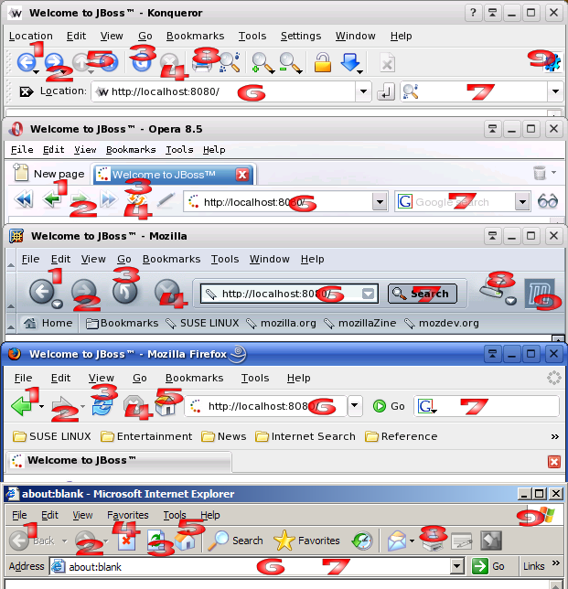
Did you miss the anecdote? it was in the part 1 of this article. Let me begin the second part of the discussion by showing you a screenshot.

Here we see the application area of the prominant browsers. Common navigational parts are obvious. There are links and other buttons. However the interface is the similar, if not exactly the same.
Parts:
- Back Button (Common to all)
- Forward Button (Common to all)
- Reload/Refresh Button (Opera uses a Stop cum Reload Button)
- Stop Button (Common with exception of Opera)
- Home Button
- Address Bar
- Search Bar
- Print Button
- Throbber
Throbber is used to show that the loading is going on. It generally shows a cool animation playing. It stops as soon the loading completes. For multi-tab implementations, putting the throbber on the tab makes sense.
These Navigational control are a must. Easily available Navigation is an essential part of Browsing. So These four buttons be placed together.
How many of you frequently use this? I use this button in the file browsing mode. I have never used it for web browsing and it is mostly an "odd man in" for non-IE browsers. IE is a special case as it is a product of a company which provides links to it's site as default home destination. For general browsing it is a certain extra button which can be left out for good.
Except for Mozilla and IE the position for address-bar is split to two for two text boxes, one for address and the other for search. Though the address bar can do intelligent search based URL pointing, the splitting of space is a sure downside as the address bar can't show a medium length URL.
The space allotted for search is not adequate to put 3 or more search key-words. However the ability to change search engines is a sure welcome step. However It could have been made better (Visit the suggestions later on)
Most users would be tempted to do printing after a print-preview from the File menu so this button is also like an extra button.
In addition to it whatever extra buttons each interface may provide, every application is more or less capable with the similar functionality.
So here the Question Arises: What prevents from an application like Konqueror from looking like the other competing products? Continued in the Next part ...
- - - - - This Article is under GNU FDL with title as FC text. Contact Author for any queries.